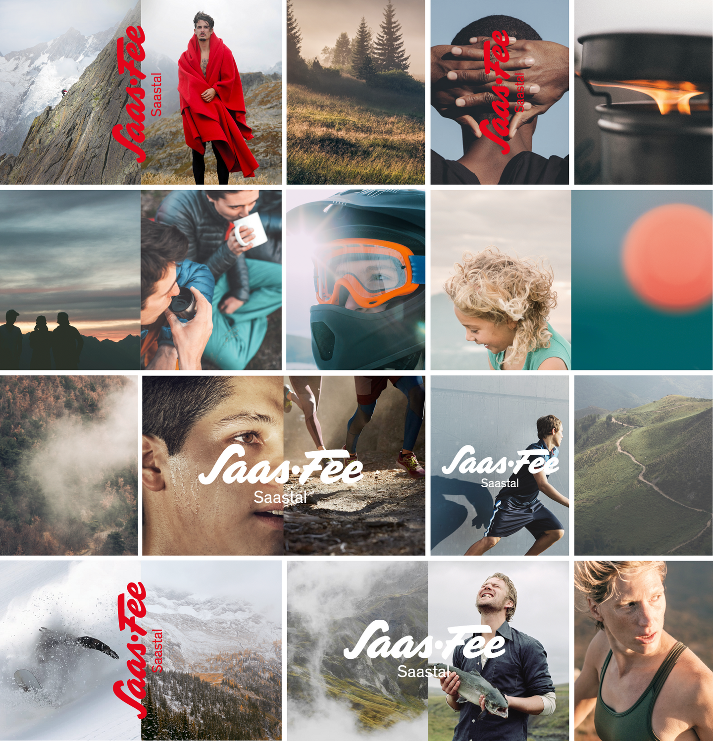
Our visual imagery showcases both the small and great challenges offered by the high-alpine holiday destination Saas-Fee/Saastal. The images are intended to evoke a desire in the viewer to experience these moments firsthand. The visual language captures authentic, unfiltered — even at times raw — moments in the natural and mountainous landscape.
Three Core Principles Apply to Our Visual Imagery:
- Close-up / Wide Shot
- Color Composition
- Visual Style
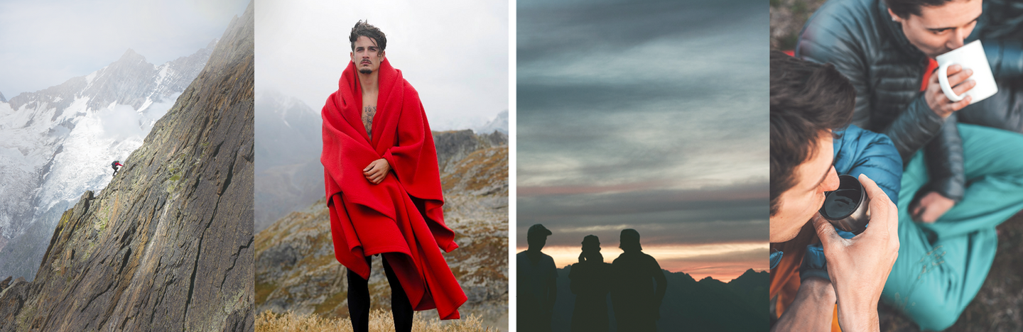
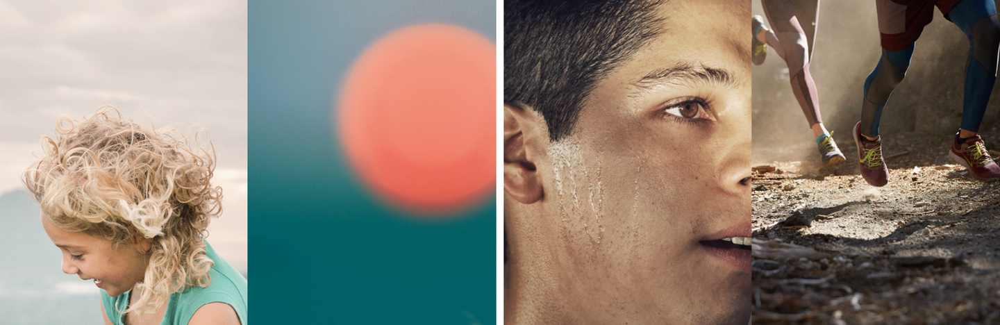
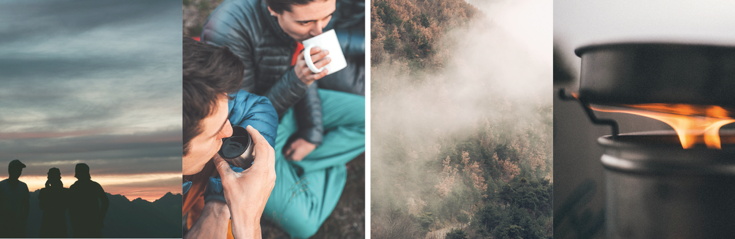
Contrast: Close-up / Wide Shot
The visual imagery is based on the contrast between close-ups and wide shots. The wide shot captures the environment in which the personal challenge takes place. The close-up presents this moment in an intimate way, often directly connected to a person. The framing should show the person from the head to the middle of the upper body at most—or even closer. This contrast creates a field of tension. Together, both images tell a short story about the personal challenges offered by the Saas Valley.
Visual Style and Editing
We prefer to work with natural light to ensure the images appear credible and authentic. This approach is also reflected in the editing: a natural look is maintained, with strong contrasts, standard saturation levels, and without stylized aesthetics (such as “moody” looks or similar).
Filming Approach
Whenever possible, we film using wide/establishing shots and close-ups. Potentially “uninspiring” medium shots are avoided whenever feasible.
The wide or establishing shot sets the scene and gives viewers a sense of the scale of people in relation to the surrounding landscape.
Close-ups of equipment or moving body parts illustrate the activity (e.g., a close-up of an ice skate, a hand gripping an ice axe, etc.). These are complemented by close-up shots of the protagonists’ faces, serving as reaction shots to convey effort, enjoyment, or joy.
Splitscreen
Inspired by the visual language used in print, we incorporate “splitscreen” shots whenever meaningful and possible. The left side features a wide shot, while the right shows a close-up of the same moment. This applies primarily to landscape formats; for vertical formats, it is optional.
Color Grading
Grading is done using a “standard look” with strong contrast, standard saturation levels, and without stylized elements (such as a “moody look”).
Contact
Saastal Tourismus AG
Obere Dorfstrasse 2
CH-3906 Saas-Fee
E-Mail:
media@saas-fee.ch
marketing@saas-fee.ch
Tel. +41 27 958 18 58